7 Event Directional Banner Tips for Global Buyers
An Event Directional Banner does more than point toward a hall, booth, or registration desk. It shapes the visitor’s first physical interaction with an event. In a crowded venue, unclear guidance can create hesitation, missed meetings, and unnecessary staff questions. Clear guidance feels professional.
The Freeman Trends Report 2024 highlights the continued importance of in-person experiences for building trust and meaningful connections. That trust often begins with small details, including readable wayfinding. A 2012 FedEx Office survey, cited by the International Sign Association, found that 68% of consumers viewed business signage as reflecting a company’s quality. The statistic is older, but its lesson remains practical. Visual signals still influence perceived credibility.
Directional banners also support smoother movement across large exhibition spaces. UFI’s Global Exhibition Barometer regularly tracks the resilience and international reach of the exhibition industry. Its findings underline a familiar challenge: global events bring together visitors with different languages, expectations, and navigation habits. A banner that works in one market may confuse another.
Size matters. So does contrast.
This guide presents seven practical tips for global buyers, covering placement, multilingual messaging, typography, materials, lighting, and reuse. It considers real purchasing details, such as venue ceiling height, viewing distance, packing dimensions, and fire-safety documentation. These details are easy to overlook. We have overlooked them before.
The goal is not to make the loudest banner. It is to create a dependable visual guide that visitors can understand within seconds. The recommendations combine event-marketing research, signage practice, and hands-on production considerations. They also leave room for review, because even a carefully designed system may need testing in the actual venue.
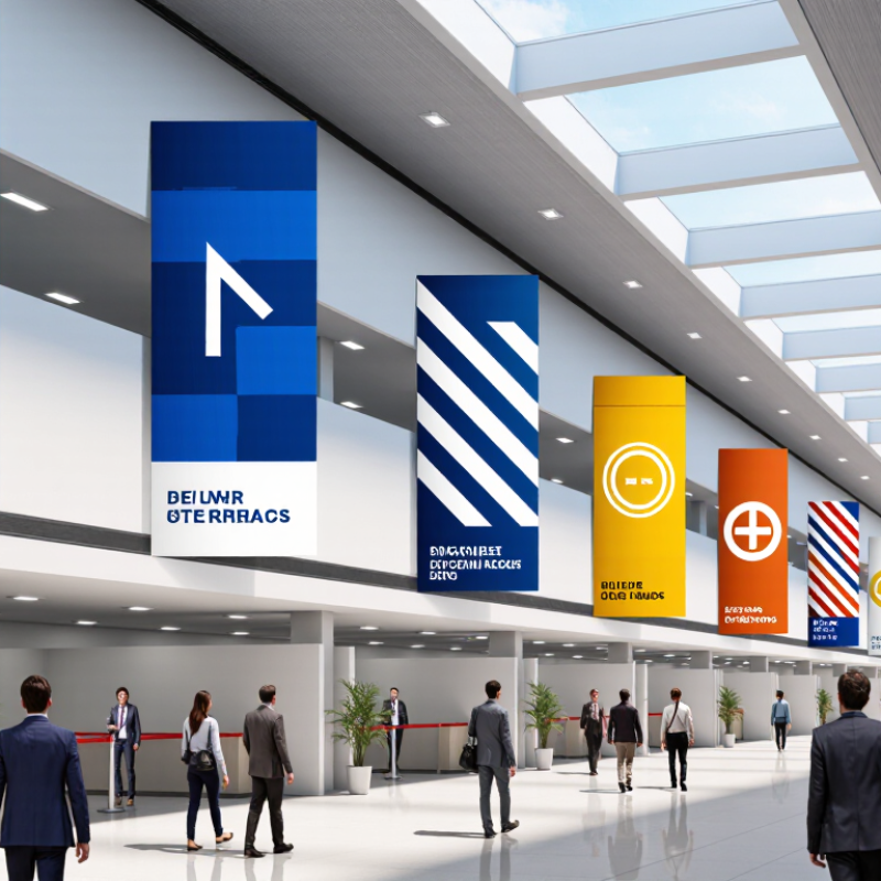
Define the Purpose and Placement of Event Directional Banners
Define the Purpose and Placement of Event Directional Banners
A directional banner should solve a specific problem: helping visitors find registration, a meeting room, or an exit. Before choosing its size or wording, map the visitor’s route from the entrance. Note where people pause, turn, or hesitate. A banner at the wrong junction may look polished but still fail.
Placement matters as much as the message. Position signs before decision points, not after them. Keep text visible above seated guests and clear of booths, doors, and queue lines. At a busy venue, walk the route from a visitor’s eye level. Check whether the banner can be read from several metres away. Small details count: glare from glass, low ceilings, and a pillar can hide an otherwise clear sign.
For international events, use familiar symbols alongside concise wording, and allow space for translated text. Test the layout at actual viewing distance; a phrase that fits on a screen may become cramped in print. It is easy to assume one sign will serve every audience, but that is not always true. Ask a colleague unfamiliar with the venue to follow the route using only the banners. If they pause, revise the placement or message.
Adapt Banner Design for Languages, Cultures, and Local Regulations
7 Event Directional Banner Tips for Global Buyers
Adapt Banner Design for Languages, Cultures, and Local Regulations
A directional banner is useful only when people understand it at a glance. Keep the destination name short, place the arrow beside it, and use a familiar icon where helpful. Do not assume colors mean the same thing everywhere. Red, for example, can signal urgency in one setting and celebration in another. A neat translation can still feel wrong.
CSA Research’s 2020 Can’t Read, Won’t Buy study surveyed 8,709 consumers in 29 countries. It found 76% prefer product information in their own language, while 40% would not buy from websites in other languages. These figures concern shopping, not event signs, but they underline why language matters. Use local spelling and venue terminology, then ask a fluent local reviewer to check the final artwork. Keep it simple.
Check local accessibility rules and venue requirements before printing. They may specify contrast, letter height, placement, or clear routes; requirements vary by location and event. Avoid placing banners where they obstruct exit signs, accessible paths, or sightlines. Print a small proof and view it from the corridor, not just a laptop. Test it onsite. A rushed review can miss an awkward phrase or a misleading arrow; build time for one more check.
Event Directional Banners: WCAG Text Contrast Benchmarks
Strong text-to-background contrast helps directional banners remain legible across venues and viewing conditions. Use these WCAG 2.2 benchmarks as a design reference, then check applicable local accessibility requirements.
Source: W3C Web Content Accessibility Guidelines (WCAG) 2.2, Success Criterion 1.4.3.
Select Durable Materials for Indoor and Outdoor Event Conditions
Directional banners face different stresses indoors and outdoors, so material choice should follow the venue, not just the artwork. Lightweight polyester hangs neatly in a conference hall, where airflow and moisture are limited. For exposed sites, ask for UV-resistant, water-repellent fabric or coated material, plus reinforced hems and rust-resistant grommets. Small details matter: a wet lower edge can flap against a pole and wear through.
The U.S. Environmental Protection Agency classifies UV Index readings of 6–7 as high and 8–10 as very high. Those levels signal stronger sun exposure, but they do not predict a banner’s service life. Ask suppliers for test results, not just “weatherproof” claims. ISO 4892-3 describes accelerated UV exposure testing for plastics; ASTM D751 covers tests for coated fabrics. Neither standard alone guarantees years of outdoor performance. Wind changes everything.
For indoor events, check the venue’s flame-performance requirements and avoid heavy material that strains hanging hardware. Outdoors, compare fabric weight, coating, seam construction, and expected wind exposure. A mesh banner can reduce wind load, though its open weave may soften fine text and images. That trade-off is easy to overlook. Request a sample, inspect its edges, and test the proposed mounting method before ordering a large run. A sample cannot mimic every storm, but it can reveal stiff coatings, weak stitching, or colors that look dull in shade.
Test Visibility, Install Correctly, and Review Visitor Guidance
7 Event Directional Banner Tips for Global Buyers
Visibility testing should happen before visitors arrive. Place the banner where people naturally slow down, not only where it looks attractive. Walk toward it from 20 meters away, then check it from both sides. Stand back. Confirm that the arrow, destination, and floor number remain clear under indoor lighting. Busy backgrounds can weaken contrast, while small text disappears quickly. A simple visitor test is useful: ask someone unfamiliar with the venue to follow the sign without assistance. If they hesitate, revise the layout. Our first design looked clear from the entrance but failed near a crowded registration desk.
Installation affects trust and safety. Use stable bases, level frames, and suitable fasteners for the surface. Check that banners do not block doorways, accessible routes, emergency equipment, or sightlines at intersections. Follow the venue’s installation rules and local accessibility requirements. Directional information should support every visitor, including people using wheelchairs or reading from a lower angle. Keep key messages at a comfortable viewing height. Test again.
Visitor guidance needs a final review during real movement, not just on a screen. Observe where people pause, turn, or ask staff for help. Compare the banner’s wording with maps, schedules, and room labels. Inconsistent terms create unnecessary confusion. For international audiences, use plain English and add carefully checked translations when needed. Avoid crowded instructions. A clear arrow often works better than a paragraph. Leave space for corrections, because event layouts change, and even experienced teams can miss one confusing turn.
